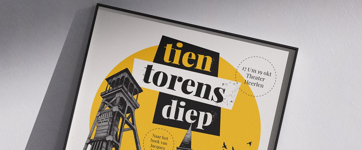
Tien Torens Diep
For the family show 'Tien Torens Diep' by PLT, Miosis was commissioned to develop an illustrative theatre poster that fits the historical, moving, and exciting story by Jacques Vriens about a mining colony in the 1950s.


For the family show 'Tien Torens Diep' by PLT, Miosis was commissioned to develop an illustrative theatre poster that fits the historical, moving, and exciting story by Jacques Vriens about a mining colony in the 1950s.
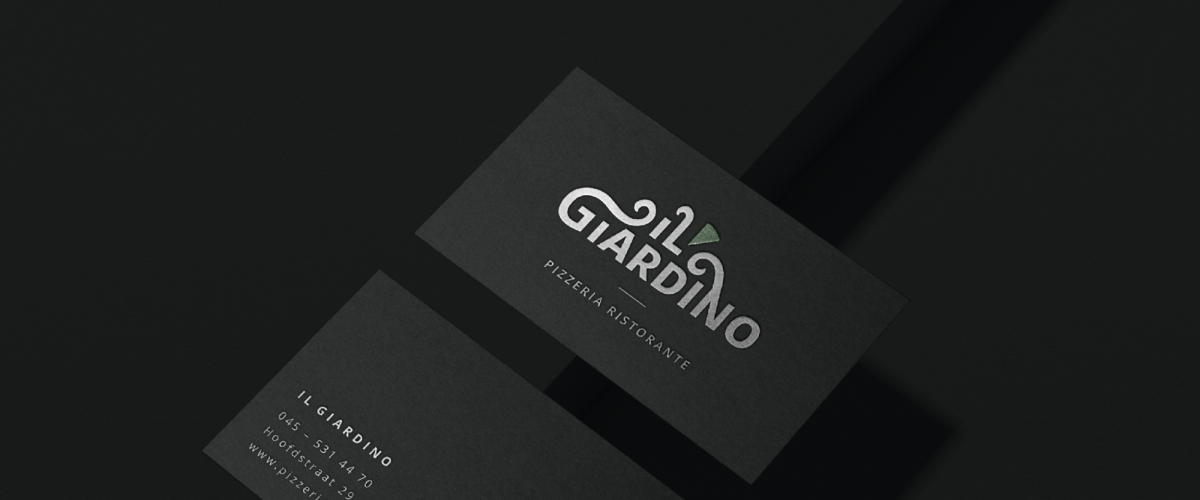
Developing a corporate identity for a restaurant is something we love to roll up our sleeves for. Il Giardino Landgraaf has gotten a nice restyling after 30 years of existence.
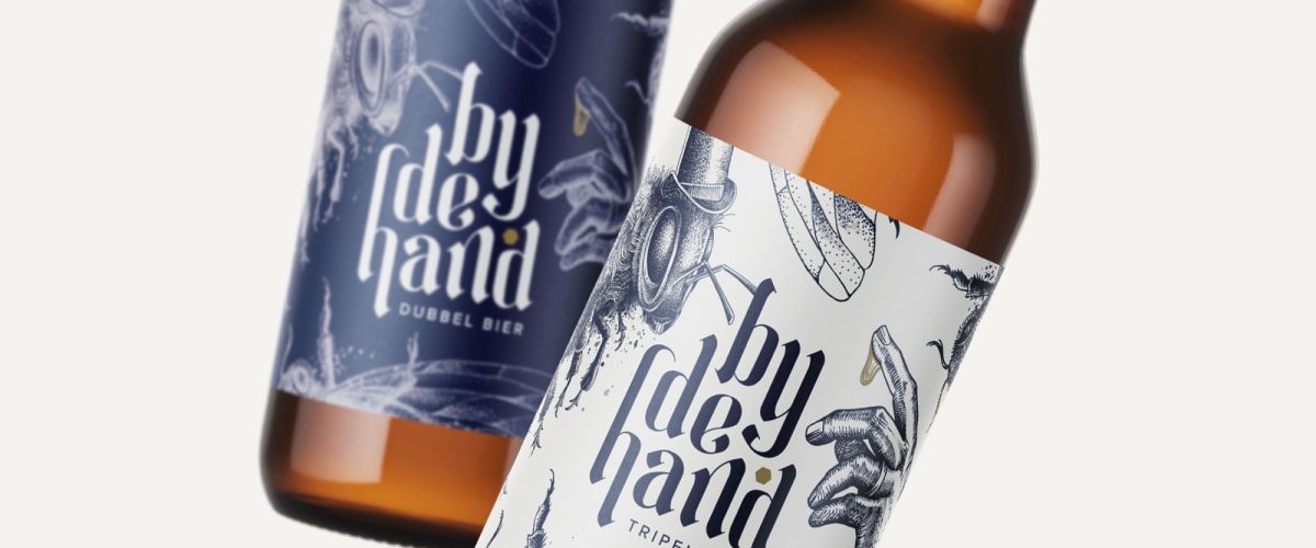
Bijdehand is a unique honey beer, brewed with love for the local environment and the bee ecosystem. The proud owners of Bijdehand turned to Miosis for a restyling of the brand.
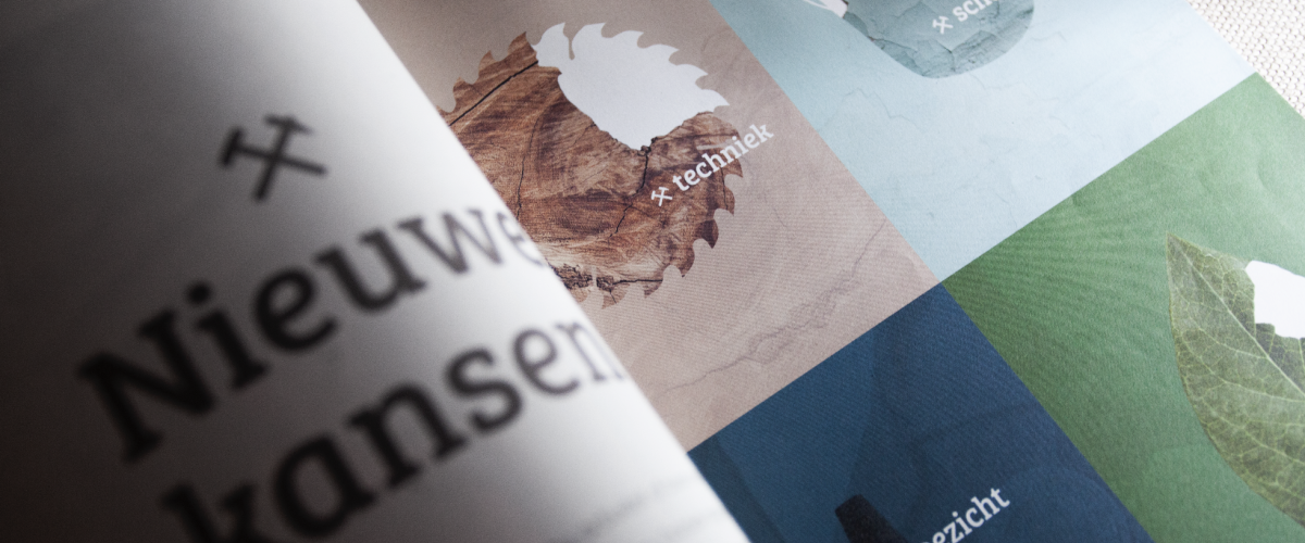
For the Bovengrondse Vakschool in Heerlen, we developed a distinctive and dynamic visual identity in collaboration with Bureau Mana. We created a design language built from structures and puzzle pieces that reflect the school’s various fields of study. Using this
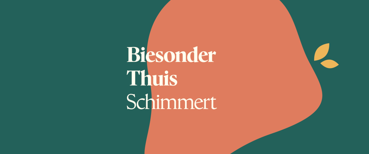
Biesonder Thuis Schimmert: a warm home for people with severe and multiple intellectual disabilities. A place where residents, families, and care professionals come together to bring out the best in one another. Miosis was commissioned to develop a recognizable and
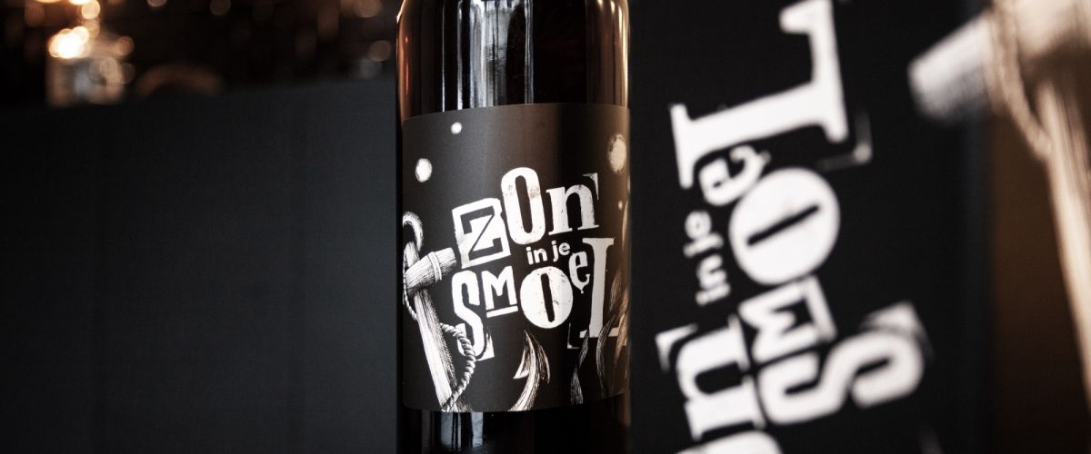
For Hello Sunshine’s anniversary year, Miosis was asked to do what she does best: develop a logo with illustrations for a specialty beer. ‘Zon in je smoel’ is dutch for ‘Sun in your face’ and it reffers to feeling good,
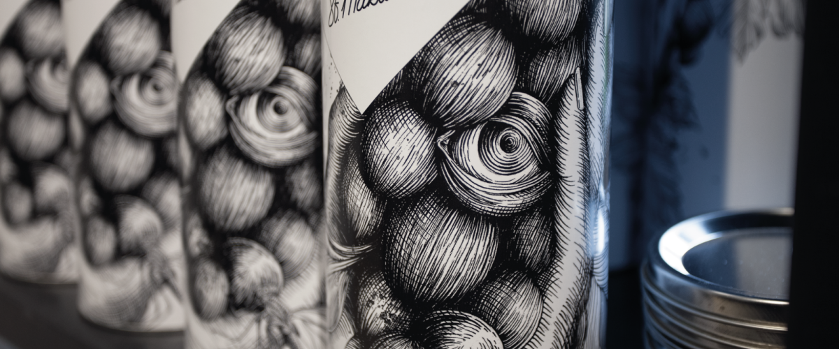
A special disguise for the well-known ‘Funkelwien’ from Wijngaard Sint Martinus in Vijlen. Completely matching with the appearance of the vineyard!
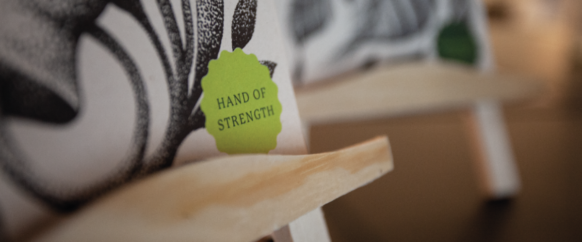
For Tree of Life Coaching, Miosis was asked to visualize Caroline Frissen’s working method: guiding people in nature where they can ‘ground’, gaining new insights together and experience growth. In an artistic, surreal style we made handy cards that can
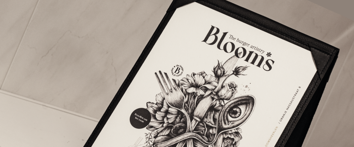
‘Bloom’s, The burger artistry’ has been a household name in the centre of Heerlen for almost three years. At Mr. Bloom’s takeaway window you could get the best vegan street food.
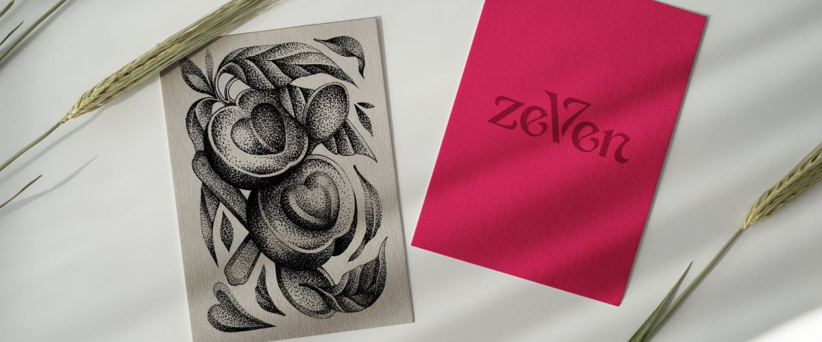
Seven: reap the fruits of life. A coaching process based on 7 key words. We were asked to illustrate this with unique, handmade illustrations of fruits.
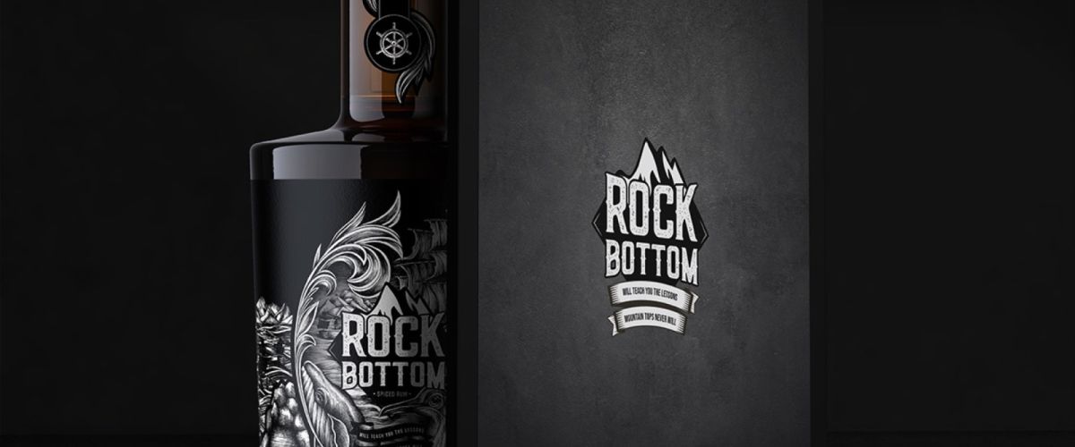
In collaboration with Visia Media, we created a brand for a rum with a raw edge: ‘Rock Bottom Rum. Teaches you the lessons mountain tops never will’. From concept artwork to final product. We made it work together!
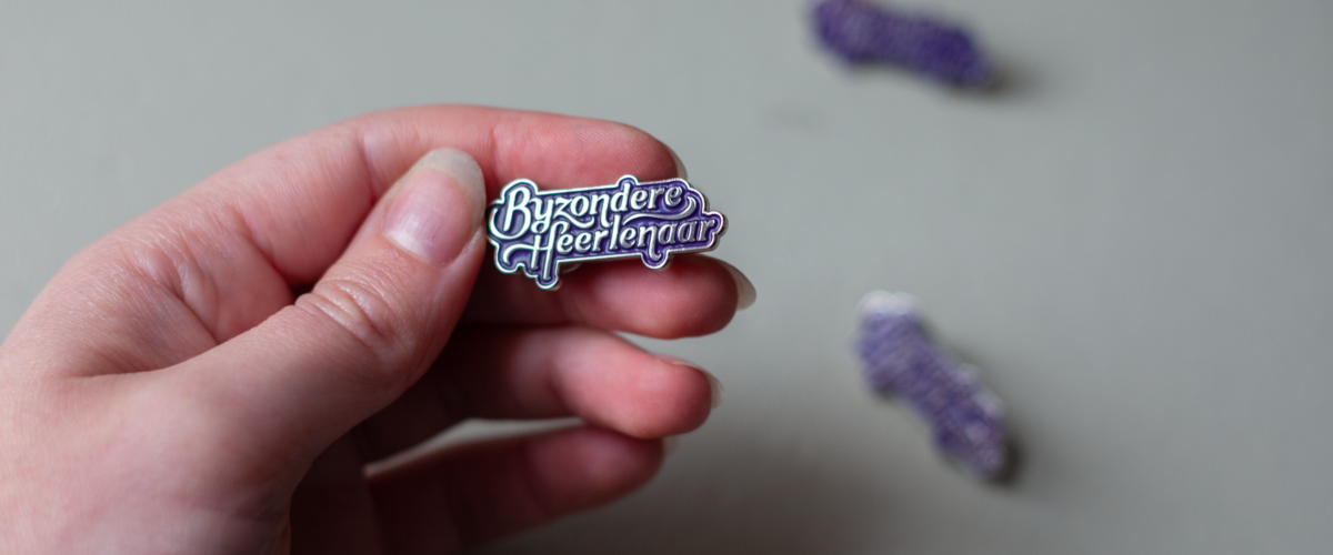
For the Municipality of Heerlen I designed this beautiful pin for the ‘Bijzondere Heerlenaar'. Anyone who is appointed by the municipality as a ‘special citizen of Heerlen’ may pin this extraordinary pin on itself!
Looking for a creative corporate identity,
packaging design, book illustration or
something else? Send me an email.